Towa
Restaurant Branding

Overview
Brand identity development for an upscale Japanese restaurant, strategically positioned at the intersection of a casual izakaya and an elevated fine-dining experience.
Towa reinterprets the art of Kaiseki for a modern audience, utilizing authentic Japanese cooking methods to create dishes that are both approachable and deeply rooted in tradition. The identity serves as a visual bridge, connecting heritage-driven culinary arts with contemporary dining culture.
Creative Services
Logo Design • Brand Identity System (Color & Typography) • Website • Menu & Stationery • Packaging Design • Photography • Spatial Branding (Interior & Signage)

Logo
Wordmark
The wordmark was crafted to project a modern and polished image while remaining welcoming to local professionals. Its minimalist approach, paired with a distinctive serif, strikes a perfect balance between high-end aesthetics and effortless legibility.
Symbol
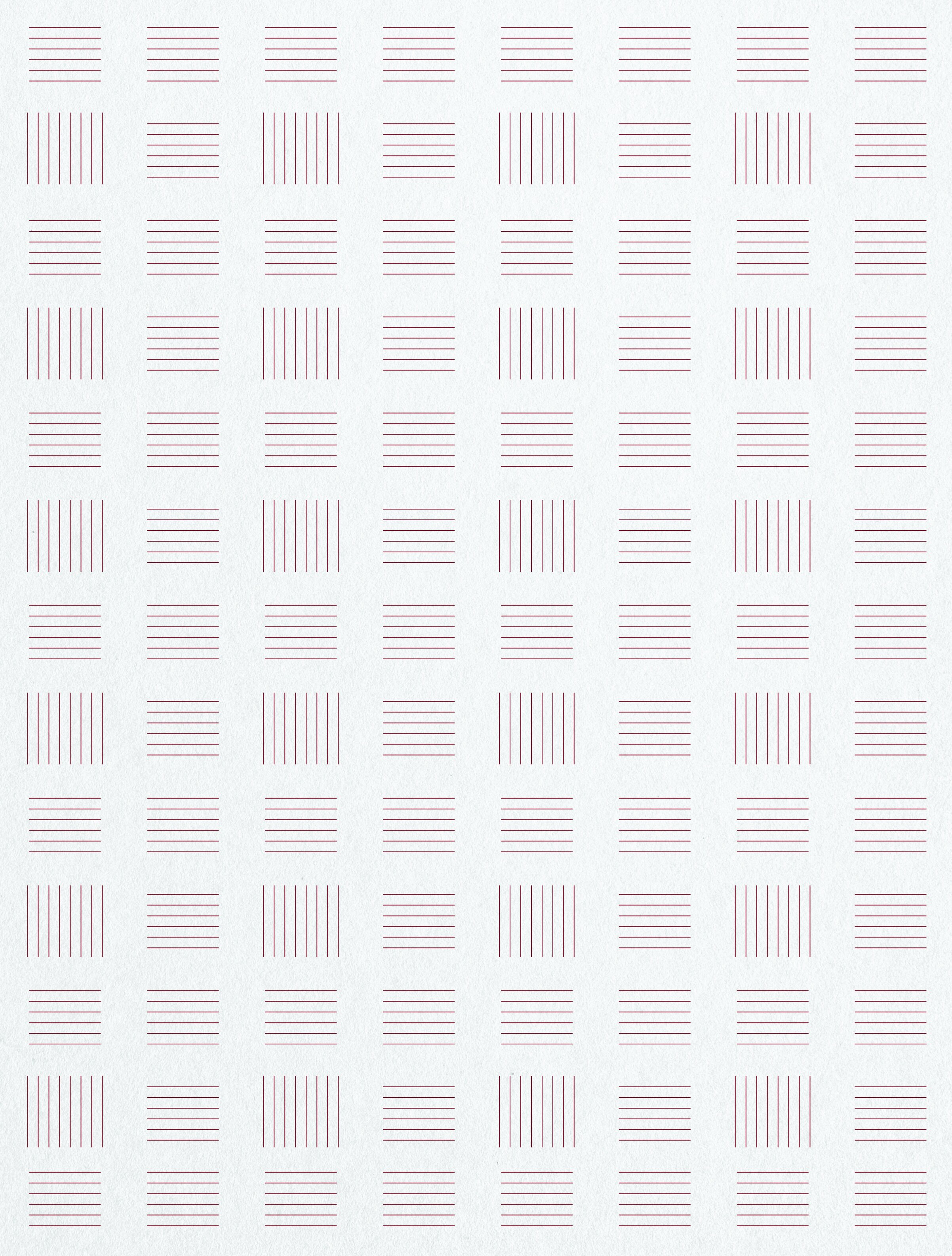
Serving as a timeless signature for the brand, the symbol draws inspiration from the geometric patterns of traditional Japanese Tatami flooring and the structural letterforms of the name.


Primary
Base
Highlight
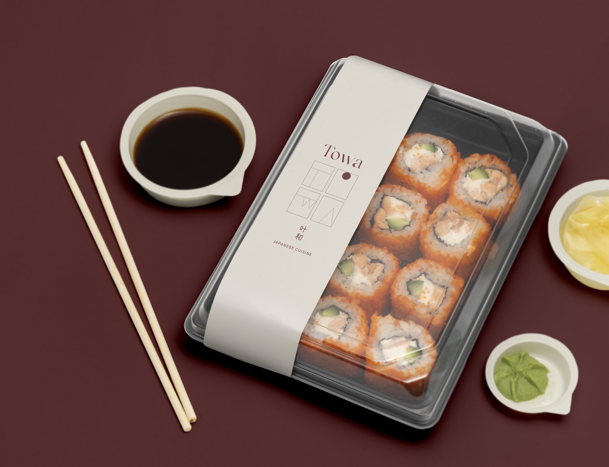
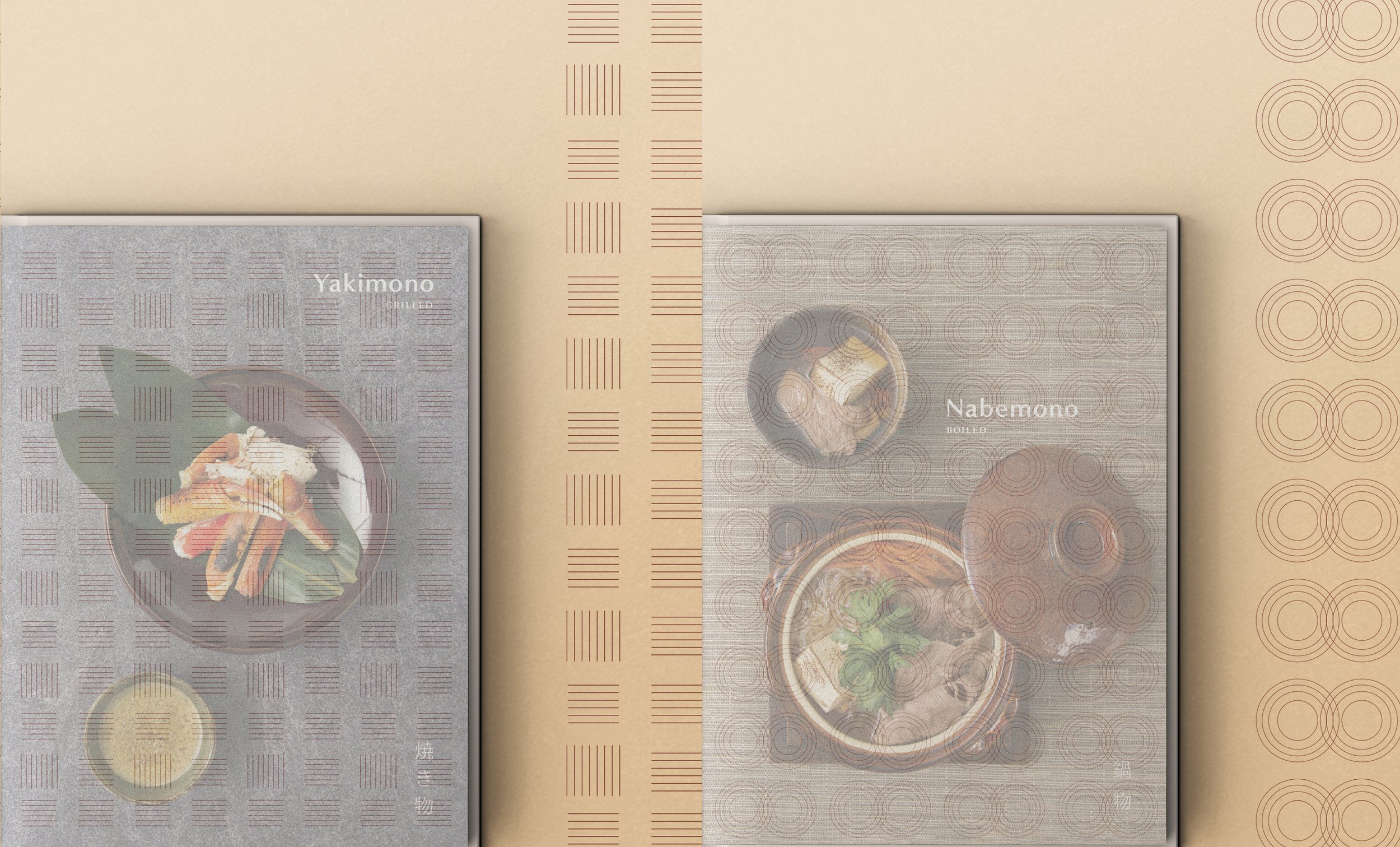
Menu
Format: A refined book-style layout that pairs opaque and transparent layers for a multidimensional feel.
Visual Motif: Custom-designed patterns that visualize traditional Japanese cooking methods, serving as a signature brand element.
Concept: A material-driven design that mirrors the precision and elegance of the Kaiseki-inspired menu.


Agemono · Fried
Yakimono · Grilled
Nabemono · Boiled

Storefront Signage
The signage serves as a visual prelude to Towa’s aesthetic, bridging the streetscape with the restaurant’s refined interior. By harmonizing organic, natural materials with a minimalist Kanji-driven design, the storefront evokes a sense of authentic Japanese heritage. This thoughtful combination creates an inviting threshold that resonates with the restaurant's calm and sophisticated atmosphere.


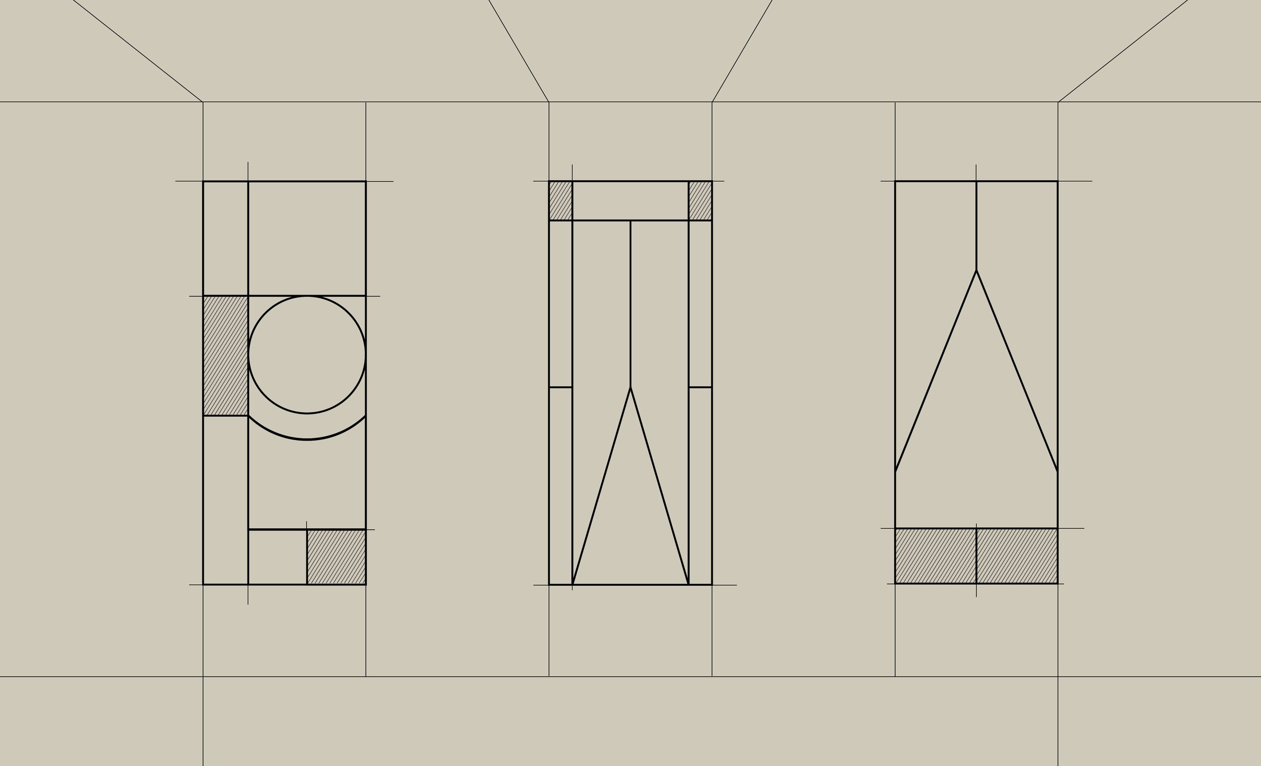
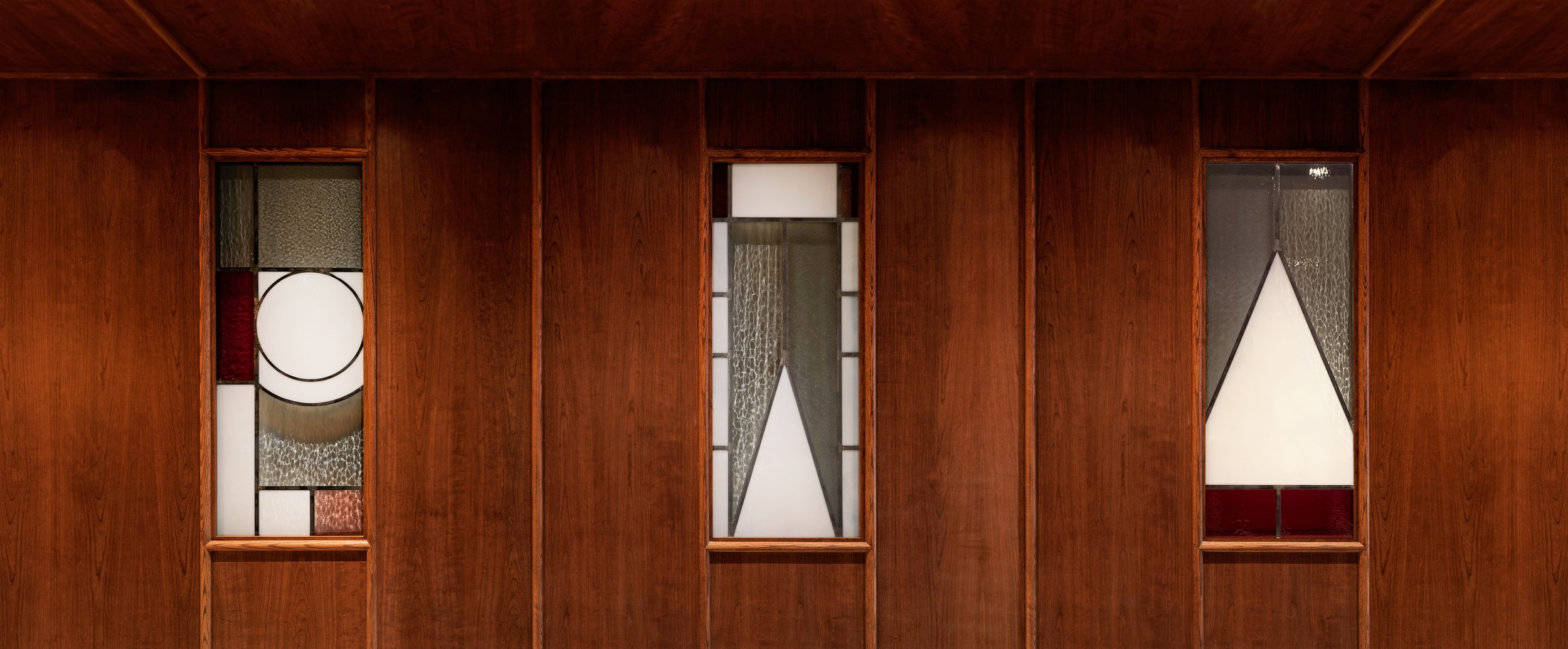
Stained Glass Triptych
This custom triptych translates the core brand icon into a cohesive visual narrative across three glass panels. Strategically installed at the entrance facing the omakase bar, the piece acts as a focal point that anchors the dining space. The design utilizes stylized patterns to evoke a sense of refined artistry, ensuring the brand identity is felt as much as it is seen.