Okonomi
Restaurant Brand Refresh
Brand Vision
Okonomi serves traditional Japanese breakfasts based on the principles of “Ichiju Sansai” and “Ichiju Gosai,” consisting of rice, soup, side dishes, and a main protein to provide nutritional and visual balance.
Project Goal
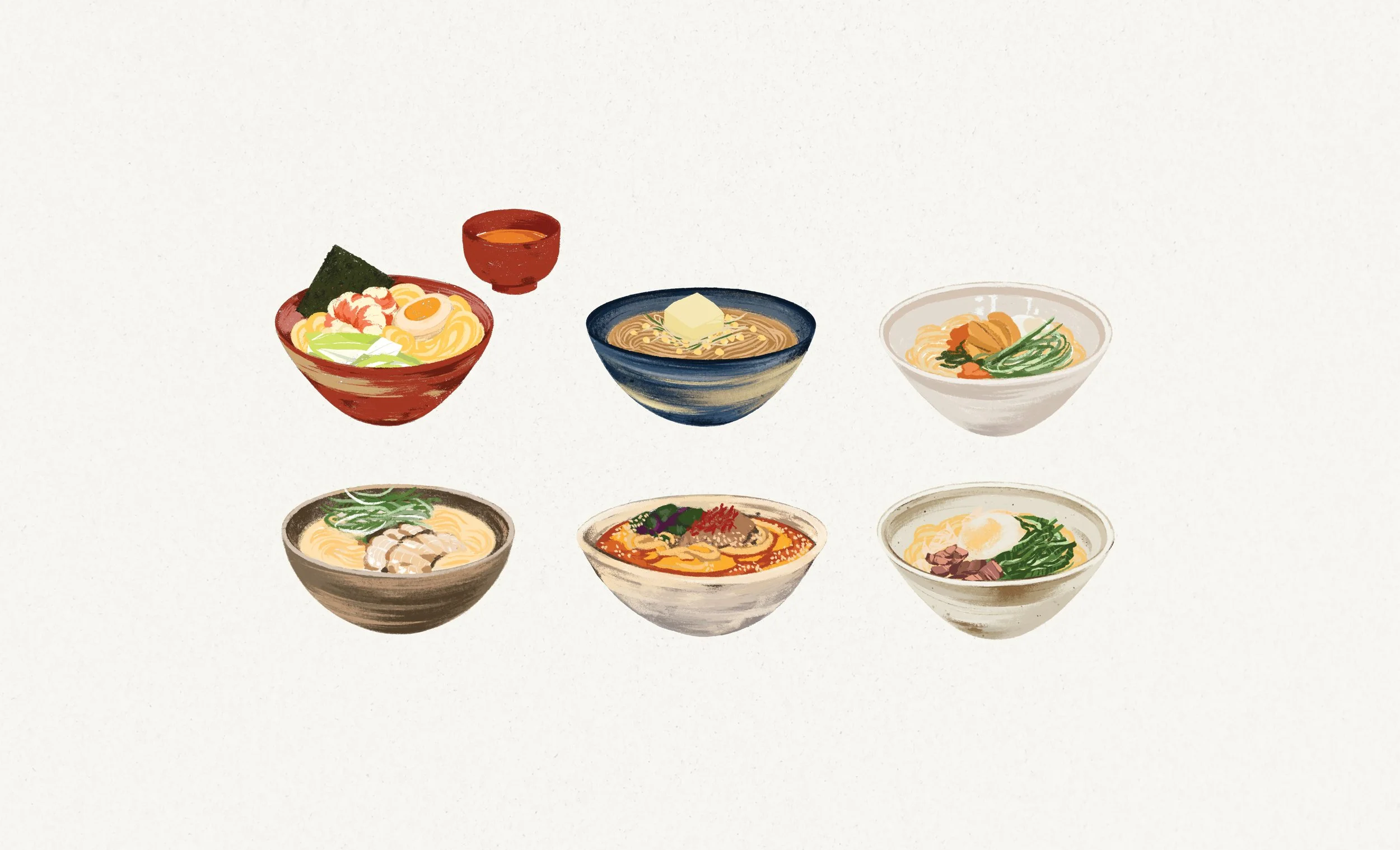
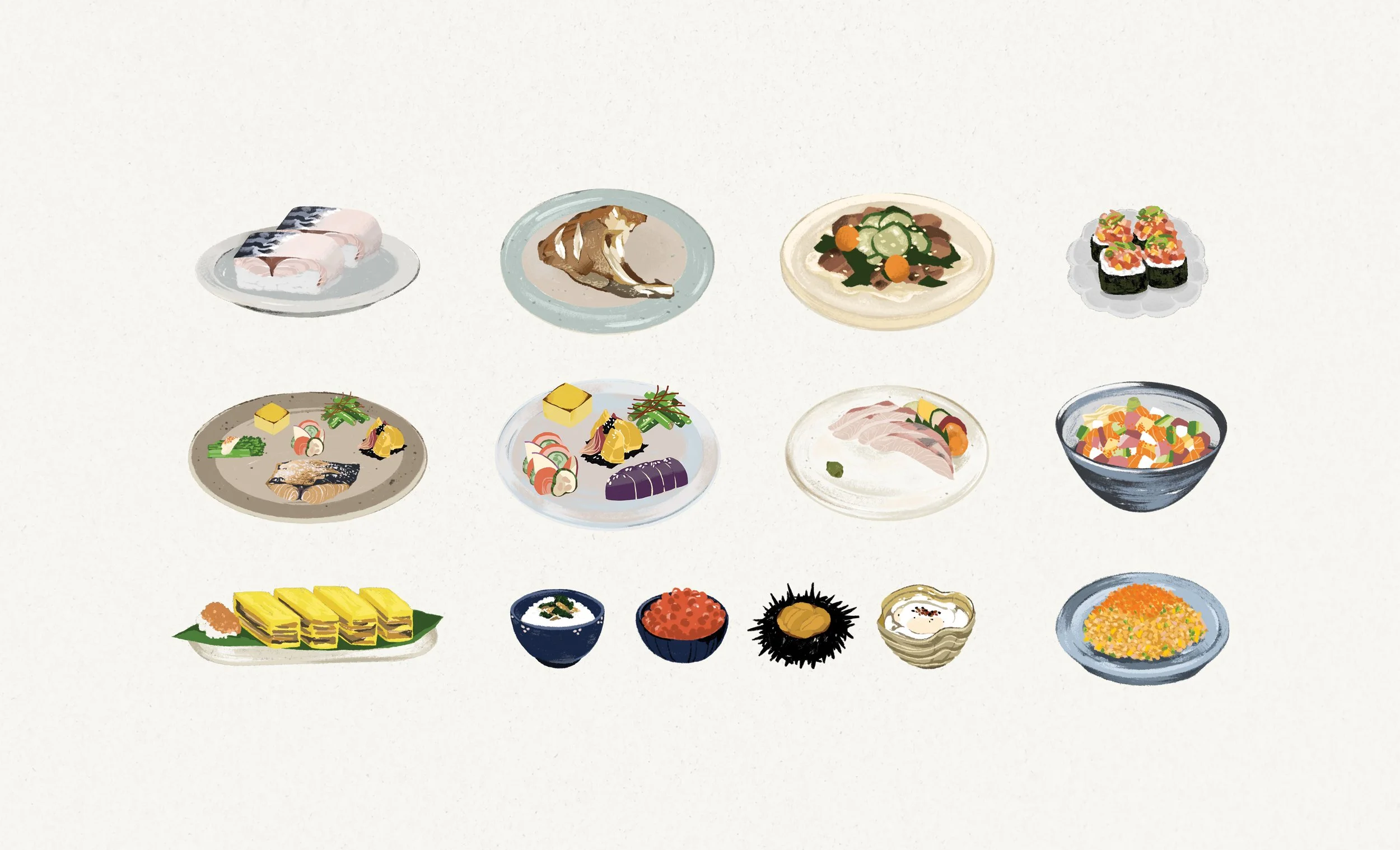
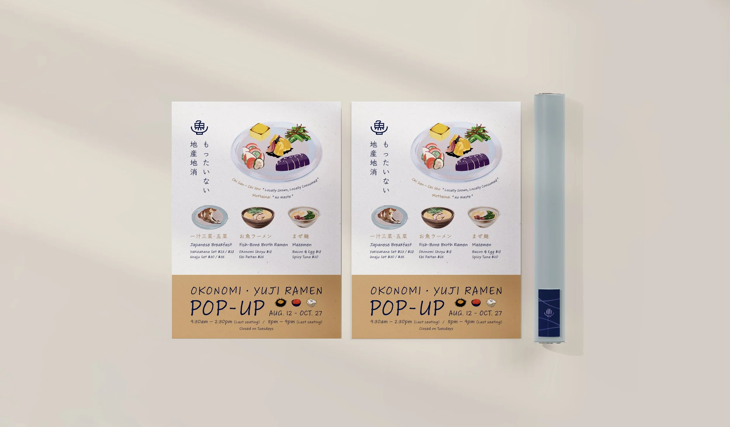
The new illustrative assets add depth to the restaurant’s human-centered identity, reflecting its commitment to carrying on the ancient philosophy of Japanese dining in New York.
Deliverables
Logo • Color Palette • Typography System • Menu • Illustrations • Website • Promotion Prints Design • Packaging Design

Navy
Hex #182845
RGB 24 / 40 / 69
CMYK 95 / 83 / 45 / 46
Cream
Hex #ebe5d4
RGB 235 / 229 / 212
CMYK 7 / 7 / 16 / 0
Sky Blue
Hex #a5b1ac
RGB 165 / 177 / 172
CMYK 37 / 23 / 30 / 0
Mustard
Hex #d3b47d
RGB 211 / 180 / 125
CMYK 18 / 27 / 58 / 0
Logo
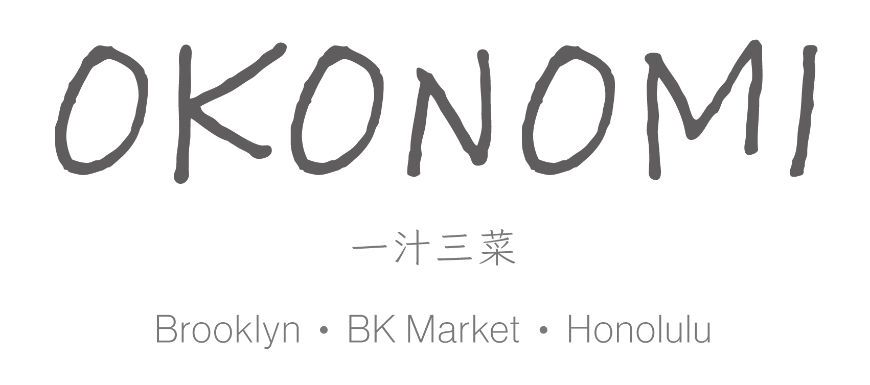
The retouched logo features a more handcrafted texture, aligning with the project’s goal of adding depth to the brand’s human-centered identity.

Original
Alternatives
Typography System
The new set of typefaces creates a visual harmony between simplicity and the brand’s personality, aligning with the new art direction.
Illustration
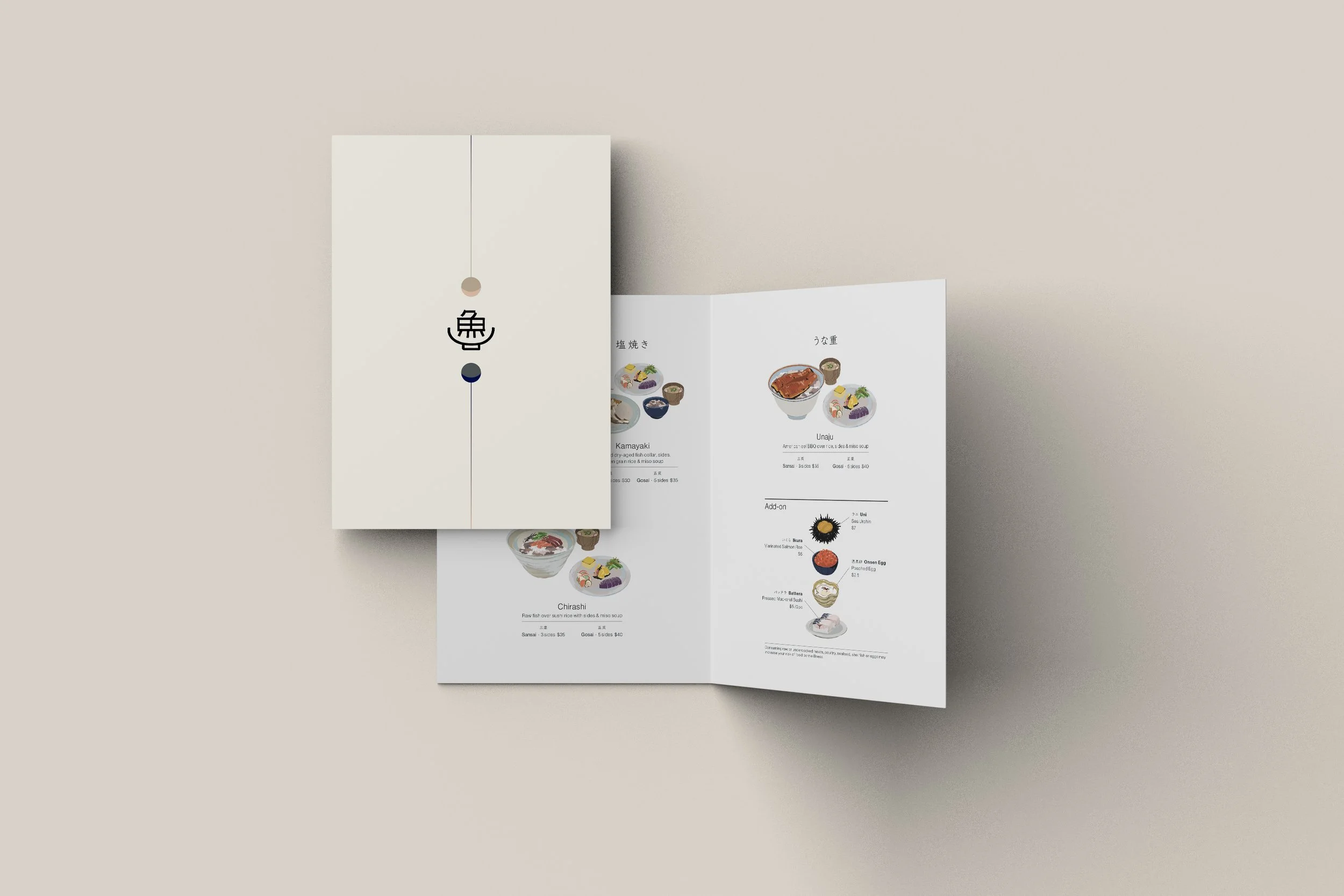
The brand’s custom menu illustrations emphasize the restaurant’s cozy, homey atmosphere while reinforcing its friendly, approachable appeal to the local community. The color palette and brushstroke textures represent the brand’s signature visual characteristics.