Okdongsik
Restaurant Rebranding
Brand Vision
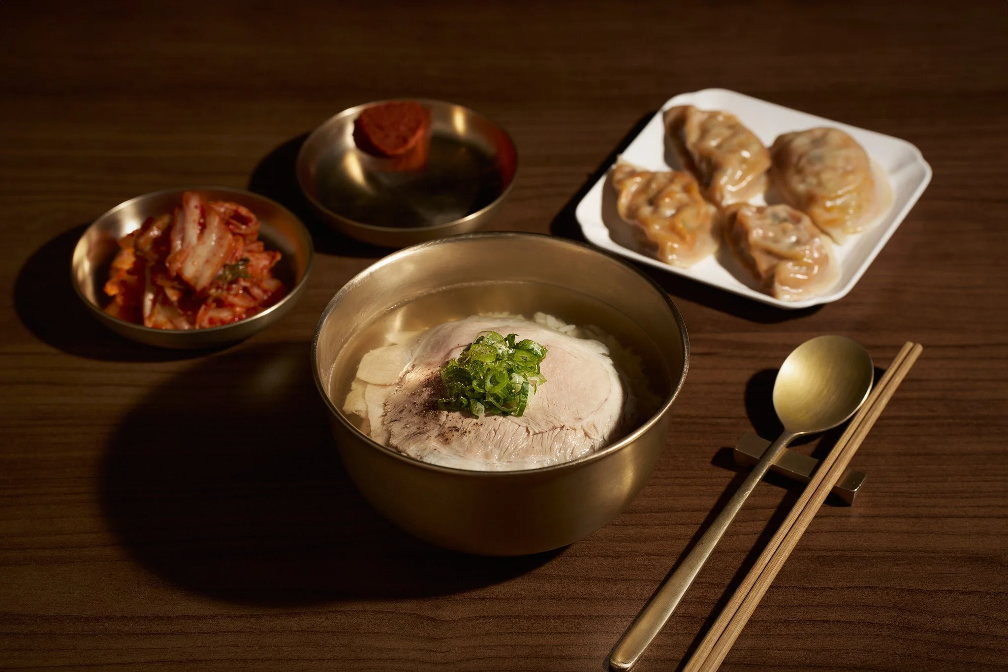
Okdongsik redefines the essence of traditional Korean pork and rice soup (Dwaeji Gukbap), transforming it into a sophisticated, contemporary dining experience.
Slogan
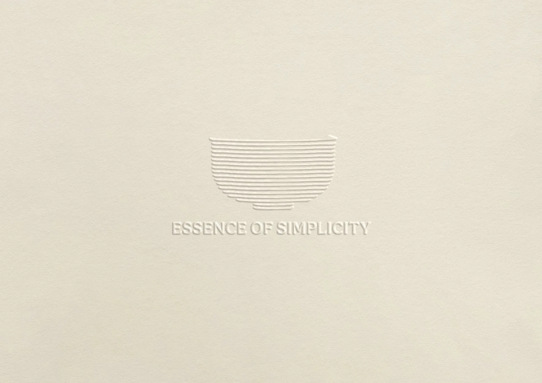
“Essence of Simplicity”
Project Goal
The new brand identity embodies the aesthetic of simplicity, aligning with its mission to deliver both the culture and the value of Korean cuisine to a global audience through a single bowl of soup.
Deliverables
Brand Identity System (Color & Typography) • Logo • Website • Menu & Stationery • Promotion Prints Design • Spatial Branding (Interior & Signage) • Social Media Strategy
Secondary
Primary
Highlight
Logo
The new brand emblem combines the traditional calligraphy brushstroke with the shape of its signature brassware in the simplest way. The delicate variation in the thickness of each line not only creates depth but also represents sophistication within simplicity.


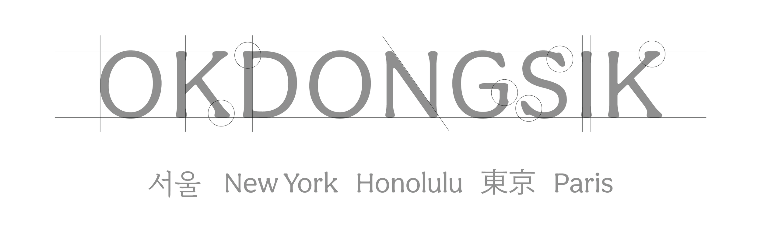
Typography System
The serif typeface captures a seamless harmony between heritage and modern sensibilities, reflecting the brand's vision of balancing authentic flavors with a contemporary dining experience. Its subtle letterforms flow effortlessly across multilingual layouts, creating a refined and cohesive visual identity.