Everydaily
Restaurant Branding
Brand Vision
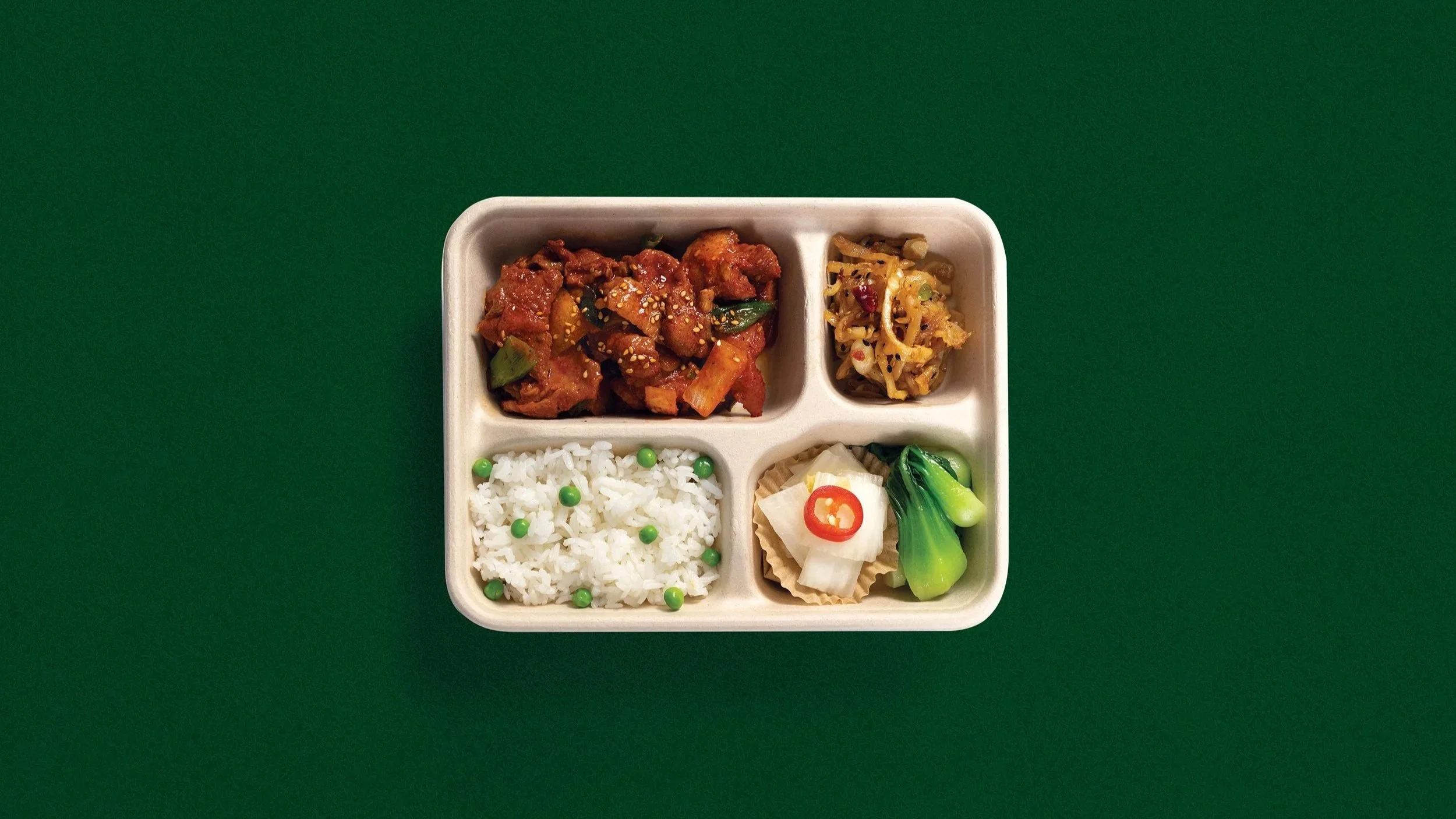
Everydaily stands as a casual grab-and-go restaurant, inspired by the concept of an Asian convenience store, reinterpreted into a modern aesthetic.
Project Goal
The brand identity brings a whimsical vibe to an ordinary concept without overwhelming the core value of keeping everything simple while maintaining quality.
Deliverables
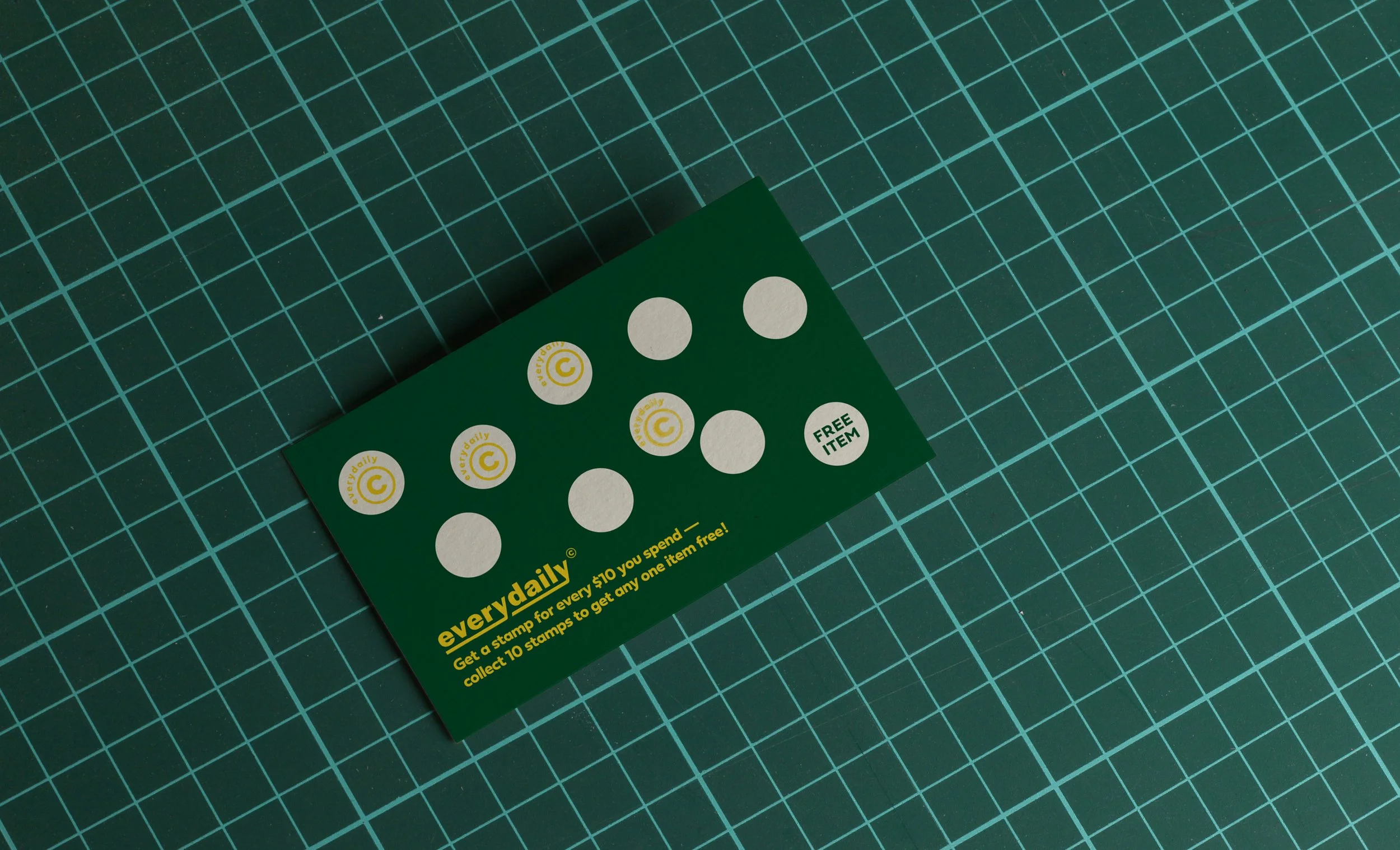
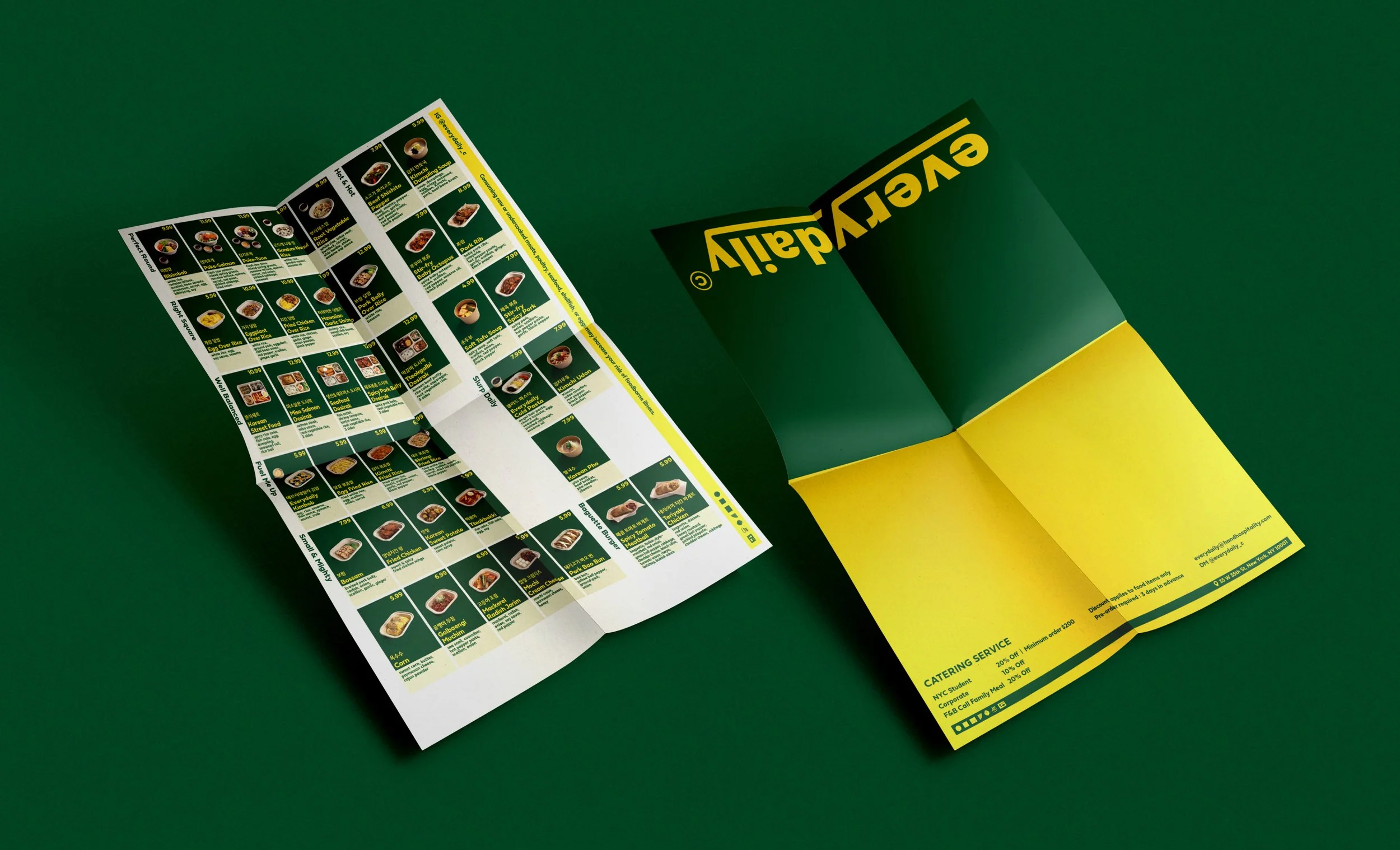
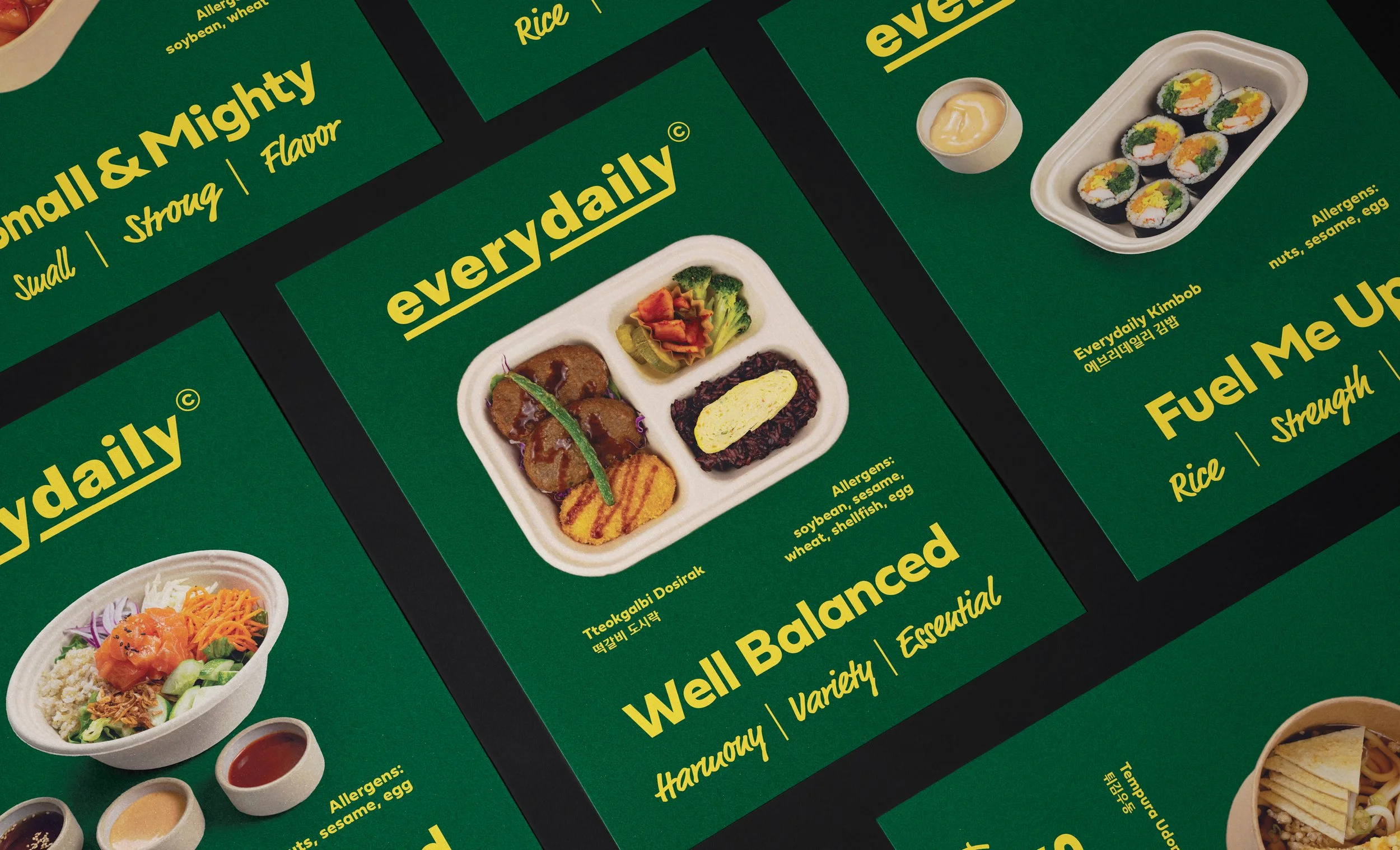
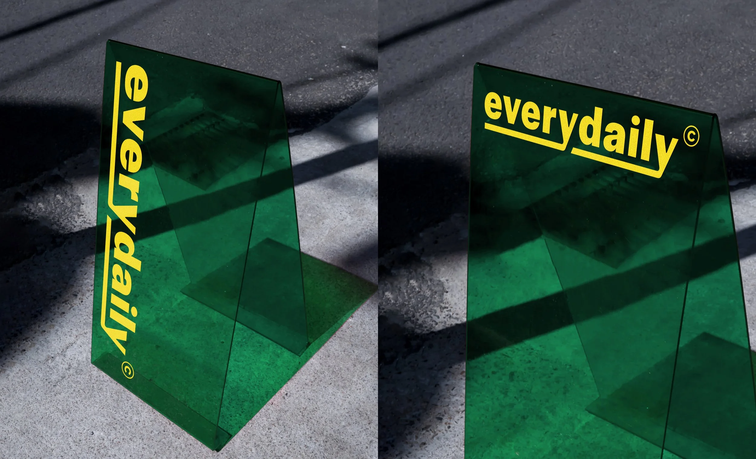
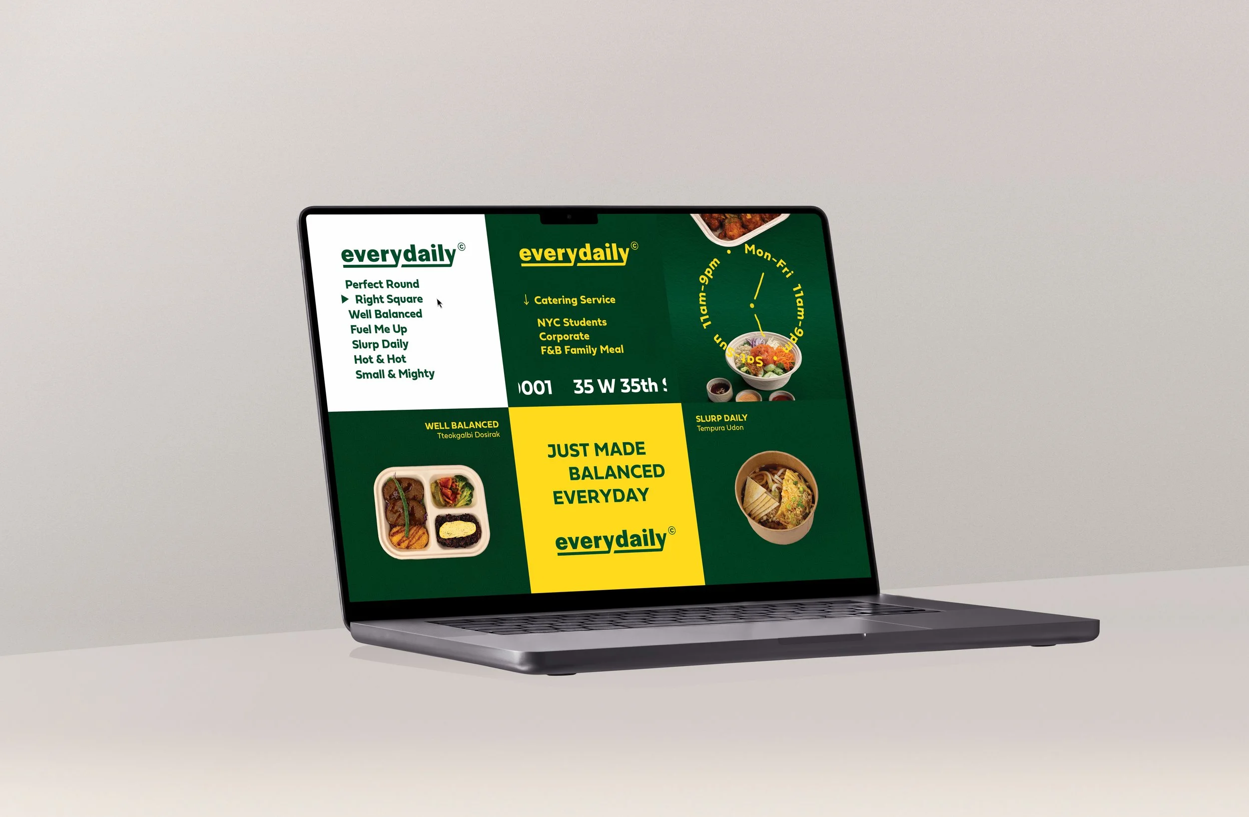
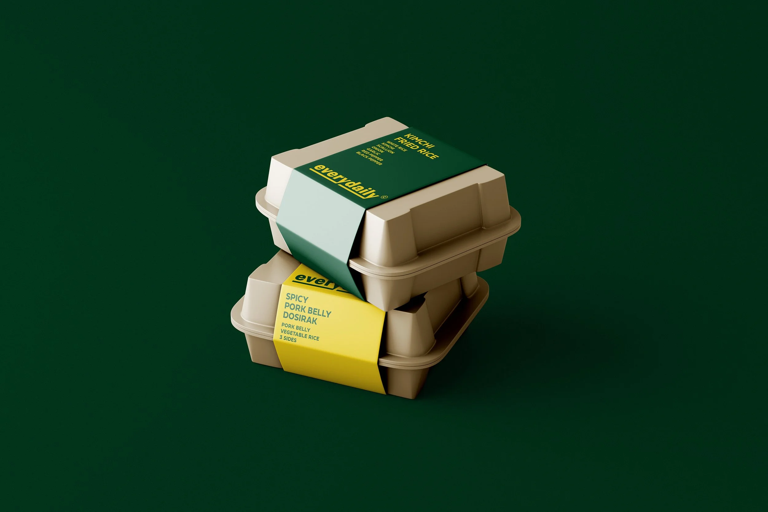
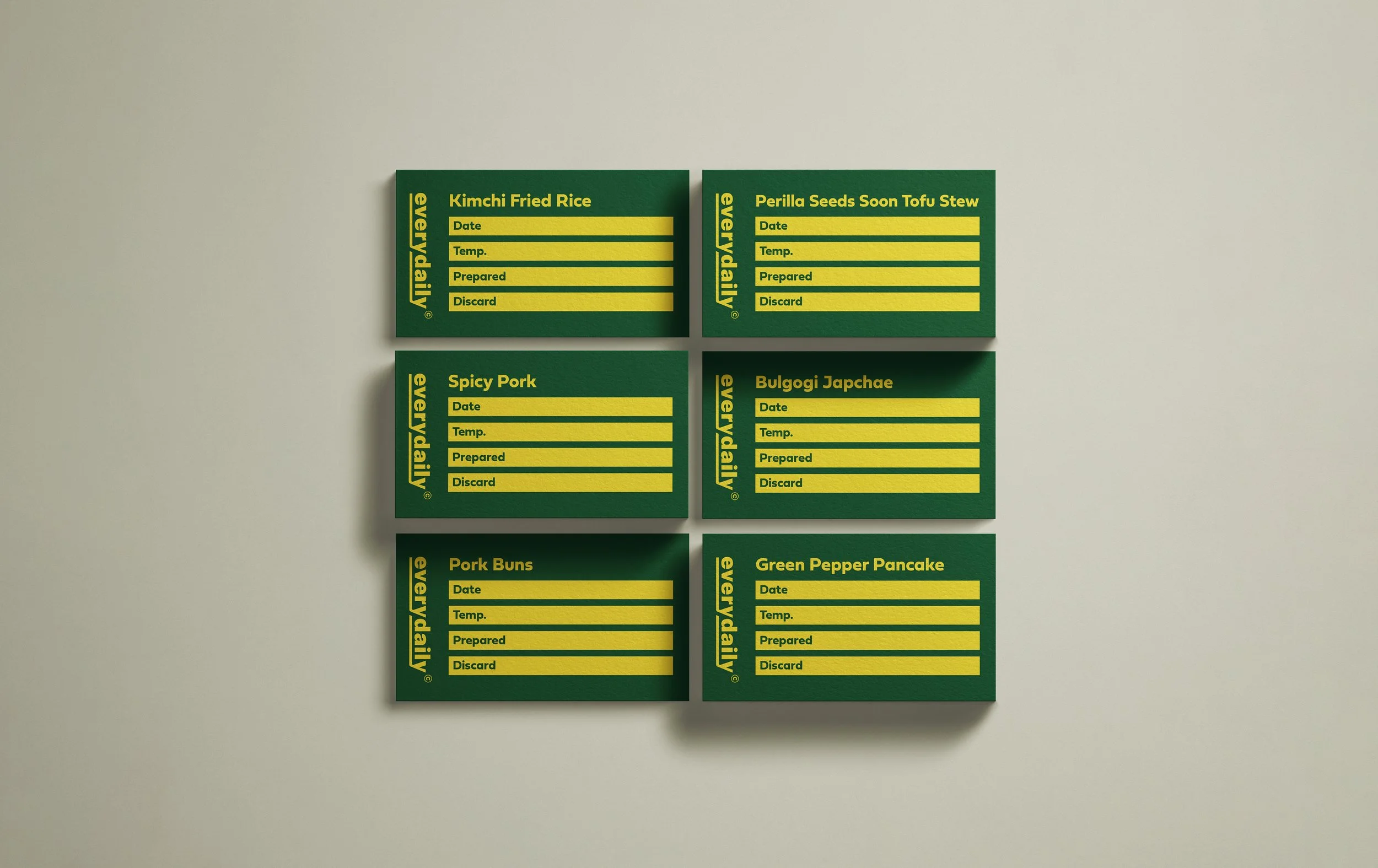
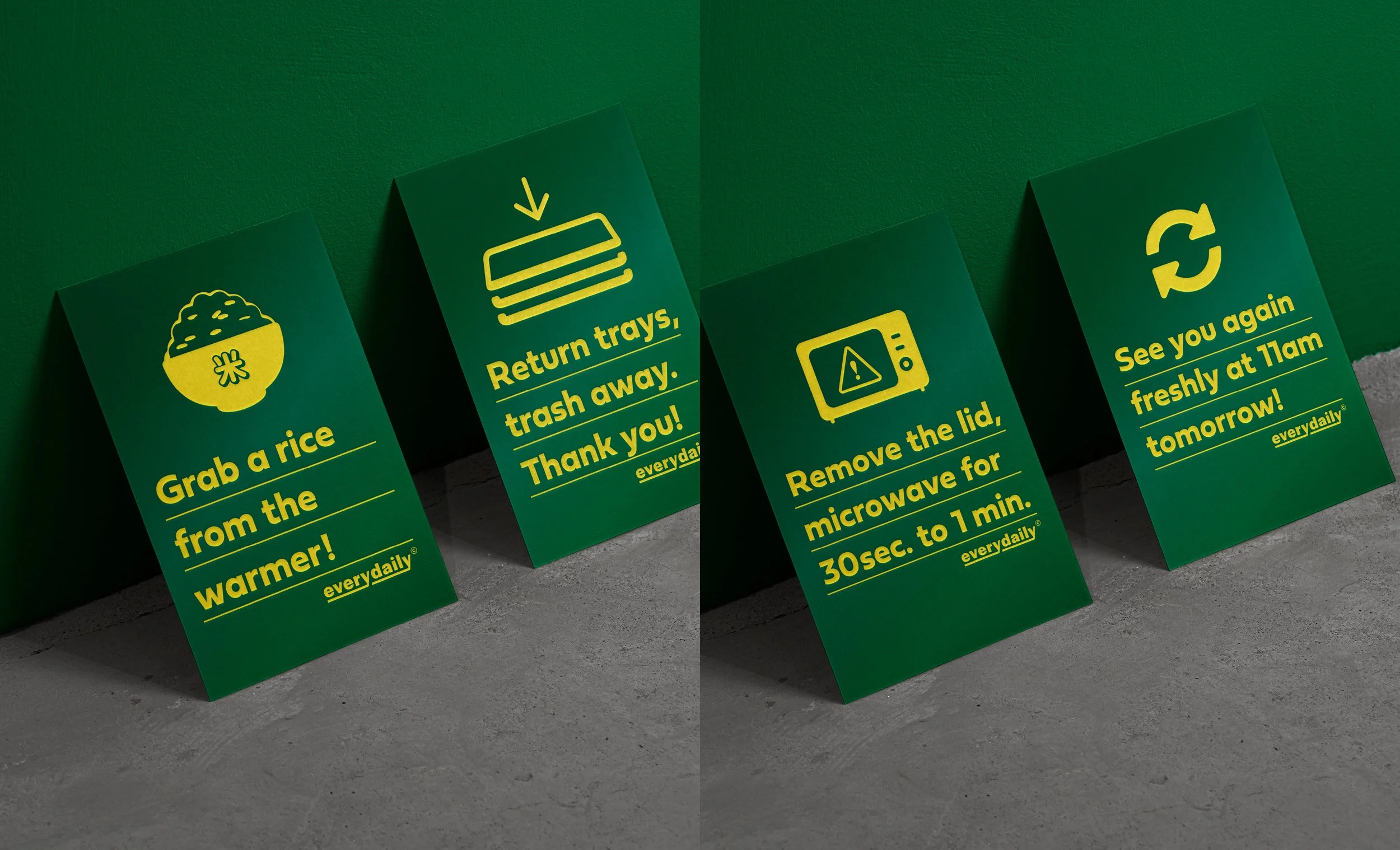
Logo • Color Palette • Typography System • Website • Menu & Stationery • Promotion Prints Design • Signage • Packaging Design
Green
Hex #004c29
RGB 2 / 77 / 42
CMYK 90 / 41 / 95 / 46
Yellow
Hex #ffda20
RGB 255 / 218 / 33
CMYK 13 / 18 / 34 / 0
Logo
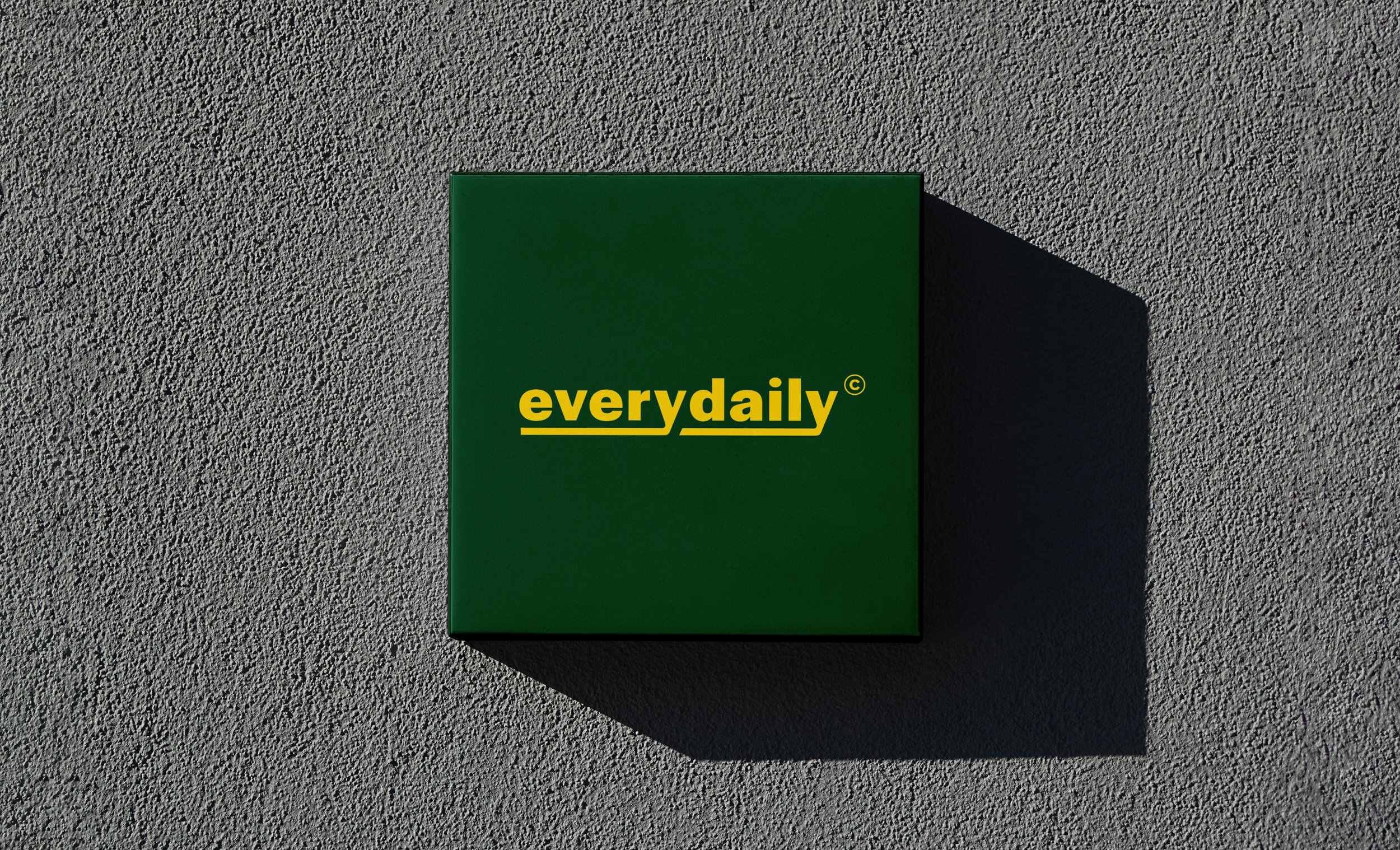
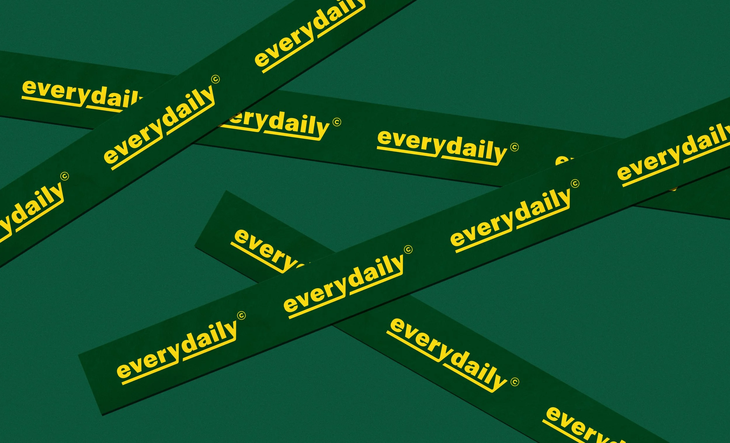
The wordmark design focuses on the brand’s simple yet bold mission to become the go-to spot where locals stop by every day for their daily meal.

Typography System
The geometric sans serif typeface creates a clean and distinctive visual identity that, together with the color palette, aligns with the thoughtfully arranged meals.