AriAri
Restaurant Branding

Overview
Brand identity development for a casual Korean restaurant in NYC’s East Village, drawing inspiration from the vibrant coastal energy of Busan, Korea.
Embodying a ‘Modern-Vinage’ spirit, the brand aims to create an inviting atmosphere that harmonizes the new and the nostalgic. This duality allows the local community to experience a seamless blend of modern dining and cultural resonance.
Creative Services
Logo Design • Brand Identity System (Color & Typography) • Website • Menu & Stationery • Packaging Design • Social Media Strategy
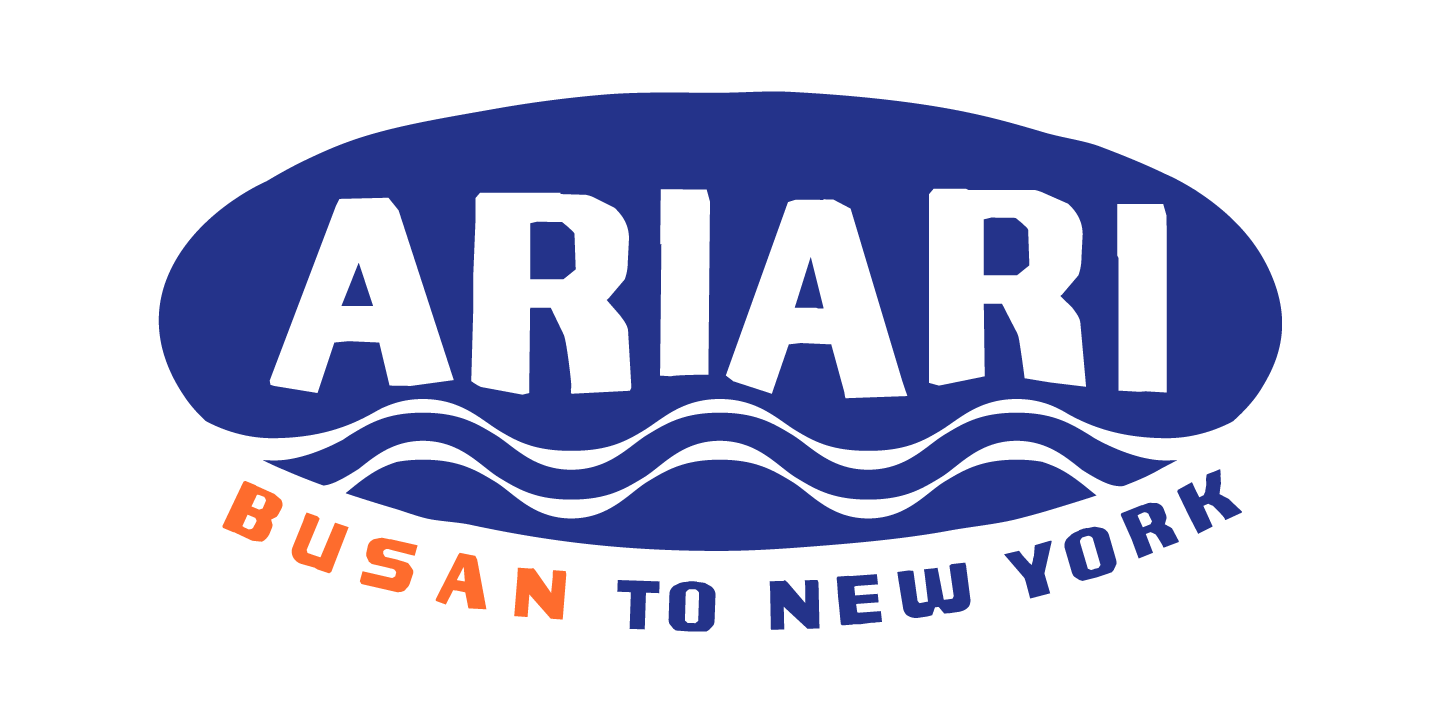
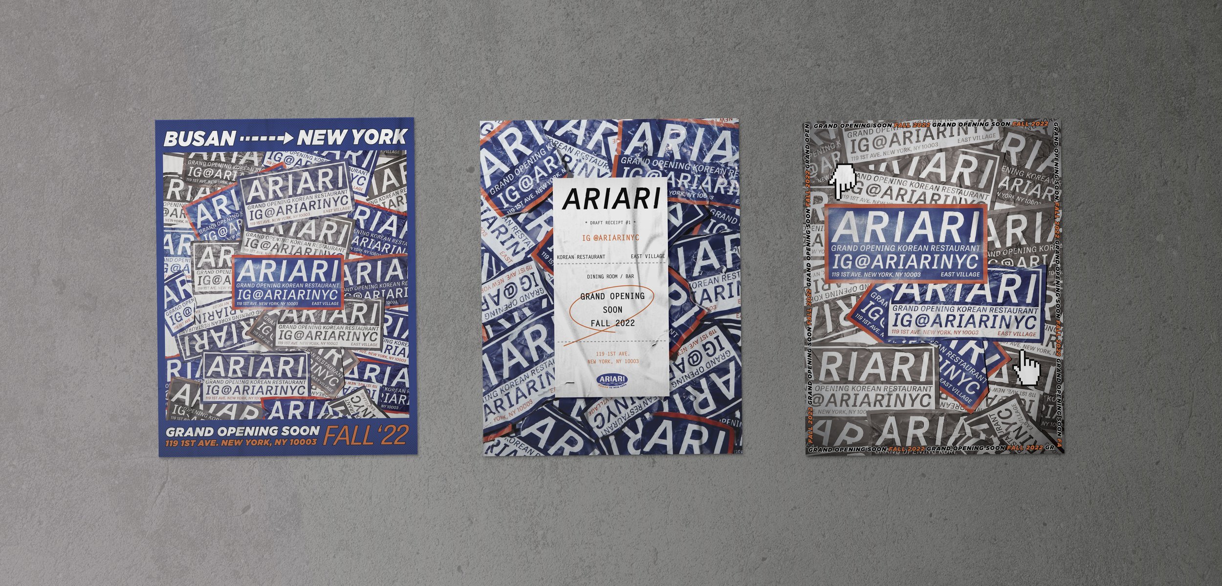
Logo
Starting as a typographic study of waves and heritage characters, the AriAri logo evolved into a vintage-inspired identity tailored for cultural localization. The inclusion of the “Busan to New York” slogan encapsulates the brand’s core narrative: bridging two distinct worlds through a shared culinary experience.


Menu
Inspired by the raw and authentic charm of traditional Korean street market eateries, the layout utilizes a heritage-driven structure to evoke a sense of cultural nostalgia. The striking juxtaposition of monochromatic photography and a vibrant color palette establishes a distinctive ‘Newtro’ aesthetic, bridging the gap between old-world tradition and modern New York energy.

Secondary
Primary
Base

Packaging
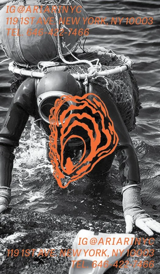
To extend the brand narrative to the takeout experience, a series of bespoke stickers were created which blend authentic photography with playful hand-drawings. These tactile assets serve as visual storytelling tools, creating a connection even outside the physical restaurant space. Each icon is a symbolic representation of AriAri’s core pillars:
Seagull: A tribute to the coastal spirit and heritage of Busan.
Ttukbaegi(Clay Pot): A symbol of the warmth and depth of authentic Korean culinary culture.
Oyster: A nod to our commitment to fresh, premium seafood as a primary ingredient.